How to Harness Serif Fonts for Timeless and Impactful Design
Serif fonts have been a cornerstone of typography for centuries, recognized by the small strokes at the ends of each letter. While modern trends often favor minimalistic sans-serif fonts, serif fonts continue to offer elegance, readability, and authority. Learning how to use them strategically allows designers to create timeless, professional, and visually compelling designs that resonate across print and digital media.
How Serif Fonts Influence Perception
Communicating Trust and Authority
Serif fonts naturally evoke a sense of credibility and tradition. This is why financial institutions, law firms, and academic publications often rely on serif typography. Using a serif font in branding instantly communicates stability and professionalism, subtly influencing the audience’s perception of reliability.
See also: How Automatic Transfers Can Help You Reach Your Savings Goals Faster
Creating Visual Flow in Text
The small strokes, or serifs, guide the reader’s eyes along lines of text, making long passages easier to read. In both print and digital content, this enhances engagement and comprehension, especially for body text in books, articles, or websites.
Conveying Mood and Style
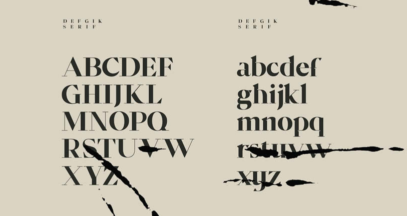
Different serif styles evoke different emotions. For instance, Old Style serifs like TT Bells from TypeType bring warmth and classic elegance, while Modern serifs (Didone) with high contrast deliver sophistication and refinement. Designers can use these variations to match the mood of their project, from approachable to luxurious.
Strategic Applications of Serif Fonts
Headings and Branding
Serif fonts make excellent headlines because they capture attention while exuding authority. They are ideal for logos, magazine covers, and key messaging where first impressions matter. TT Rationalist from TypeType, for example, offers a bold slab-serif style perfect for striking headlines.
Body Text for Readability
Long-form content benefits from serif fonts’ natural readability. The guiding strokes improve eye movement across paragraphs, making them suitable for books, reports, and digital articles. Pairing a serif body font with a clean sans-serif for subheadings creates a harmonious balance.
Combining Serif Fonts with Design Elements
Serif fonts pair beautifully with modern design elements like geometric shapes, vibrant colors, or minimalistic layouts. This combination creates a contemporary feel while maintaining the elegance of traditional typography. Using serif fonts alongside imagery or graphic accents enhances the overall visual impact without overwhelming the audience.
Common Mistakes to Avoid
Overloading Designs with Multiple Serif Styles
Using too many serif variations in one project can appear cluttered and inconsistent. Stick to one primary serif font and, if necessary, pair it with a complementary sans-serif font for contrast.
Ignoring Digital Legibility
Not all serif fonts render well on screens. Some high-contrast or overly decorative styles may become difficult to read at small sizes. Always test serif fonts across devices to ensure clarity.
Using Serif Fonts Out of Context
Serif fonts convey authority, elegance, and tradition. Using them in overly casual or playful contexts can feel out of place. Match the font style to the tone and audience of your project for best results.
Enhancing Creativity with Serif Fonts
Designers can push the boundaries of serif fonts creatively without compromising readability. Techniques such as layering with colors, adding subtle textures, or combining with modern layouts allow serif fonts to remain fresh and engaging. For example, using a classic Old Style serif for a headline with geometric shapes in the background can create a modern yet sophisticated look.
Conclusion
Serif fonts are far more than traditional typefaces—they are versatile tools that enhance readability, communicate authority, and elevate design aesthetics. By understanding how different serif styles influence perception, applying them strategically in headings and body text, and combining them creatively with modern design elements, designers can craft visually compelling and timeless projects. Leveraging serif fonts thoughtfully ensures that both print and digital designs resonate with clarity, elegance, and professional appeal, making them an indispensable asset in any designer’s toolkit.


